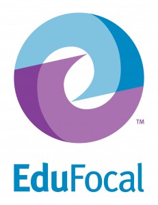
This mark consists of two swirls that come together and overlap to create a full circle.
The overlapping of the shapes represents EduFocal’s mission of connecting students with teachers. The shapes also represent how students can become mentors as they learn and reach a certain level. This is shown by the shape of the swirls, which starts as a small point, and then grows and widens until they overlap to create a full circle.
For the wordmark, a sans serif typeface was chosen for its clean and contemporary feel. However, this specific typeface also has organic details that make it both approachable and unique.
Blue was chosen as the main color for this mark because it is thought of as a friendly and trustworthy color. This particular bright shade of blue is vibrant enough to make it stand out among others
The color purple was chosen because it was a nice compliment to the main blue color of the logo, without competing or overpowering it. Purple is also associated with inspiring creativity, which is important in the education world.
Tip: Look close enough and you’ll see an e inside the circle. 🙂


Introducing the EduFocal Report Card
First!!!!!!!!!!!!!! ...
EduFocal + The Jamaica Observer: The Details!
I am very interested in your program for my son bu ...
EduFocal + The Jamaica Observer: The Details!
wish i could understand more about this website ...
EduFocal + The Jamaica Observer: The Details!
because i am in grade six it can help me with my g ...